Visual ideas
10 posts • Page 1 of 1
Visual ideas
![]() by Kasper Hviid » Sun Feb 12, 2012 12:42 am
by Kasper Hviid » Sun Feb 12, 2012 12:42 am
COLORS
I really love the programs color options which are truly innovative. However, the Default palette is not suitable to be used as the Default, since the colors are based on what the screen is able to show and not the colors found in real life.

NEW VISUAL STYLE
I think Algodoo could benefit greatly from a visual update. There is a really great GUI and some really impressive physics, but it's like the actual visual representation simply isn't there. I'm not just talking about eyecandy, I'm talking about that I have no real feeling of the weight or dimensions of the object I am creating. Sure, there are physics, but they feels like the abstract physics in a abstract computer program. Especially because I, like everyone else, uses the Default material. What is that, "Default"? It sure can't be found in the periodic table.
Below is a scene I made, called "bristledriver" in Algobox. It is really just an ordinary bristle bot, and not even close to some of the great machineries created by others. But it demonstrates how better visuals can give the creations a foundation in a physical world:

The current visuals looks like MS Paint. I think you need to do a brainstorm about how you want the visuals to look. One way to go was to imitate the look of cutout animation:
http://www.youtube.com/watch?v=SxeuNiO6WXI
The wood texture could then be something that was mixed with some paper texture to make it look like something that had been cut out of a magazine.
Another source of inspiration: Take a look at how the movie "Moomins and the Comet" uses flat materials to create a truly rich world:
http://www.youtube.com/watch?v=d3SEJSK_jqg
I imagine that Algodoo could have 2D physics, while the world was rendered in some sort of 3D, where some of the textures bulged outwards and where the objects casts shadows and has tinted highlight at their fringes.
You could also aim at flat, vector style, perhaps with hard drop shadows.
Let there be a more advanced rendering of textures. There could be different textures based on the size of the object, so that a giant piece of wood consisted of several large wooden boards nailed together. This would also serve to give a better feeling of the actual dimension of what you're looking at, something that I think Algodoo really lacks. Also it would be nice if the visual representation could be adjusted to the objects form. Also, it should be possible to decide if a texture should be sized up when the object is resized.
Add a texture to the background. Let it change according to the selected palette.
ADD SOME BASIC OBJECTS
Let there be 100+ component objects that the user can use:
CIRCLES: Bowling ball, marble, golf ball, football, beach ball
BOXES: Various materials in varios sizes. Bricks. Wooden box.
POLYGONS: nails, pencil, pliers, wine glass, fork, duck, human, car, bus, eiffel tower, ferry, whale ...
(of course, this should fit with the visual style of the program)
I really love the programs color options which are truly innovative. However, the Default palette is not suitable to be used as the Default, since the colors are based on what the screen is able to show and not the colors found in real life.
NEW VISUAL STYLE
I think Algodoo could benefit greatly from a visual update. There is a really great GUI and some really impressive physics, but it's like the actual visual representation simply isn't there. I'm not just talking about eyecandy, I'm talking about that I have no real feeling of the weight or dimensions of the object I am creating. Sure, there are physics, but they feels like the abstract physics in a abstract computer program. Especially because I, like everyone else, uses the Default material. What is that, "Default"? It sure can't be found in the periodic table.
Below is a scene I made, called "bristledriver" in Algobox. It is really just an ordinary bristle bot, and not even close to some of the great machineries created by others. But it demonstrates how better visuals can give the creations a foundation in a physical world:
The current visuals looks like MS Paint. I think you need to do a brainstorm about how you want the visuals to look. One way to go was to imitate the look of cutout animation:
http://www.youtube.com/watch?v=SxeuNiO6WXI
The wood texture could then be something that was mixed with some paper texture to make it look like something that had been cut out of a magazine.
Another source of inspiration: Take a look at how the movie "Moomins and the Comet" uses flat materials to create a truly rich world:
http://www.youtube.com/watch?v=d3SEJSK_jqg
I imagine that Algodoo could have 2D physics, while the world was rendered in some sort of 3D, where some of the textures bulged outwards and where the objects casts shadows and has tinted highlight at their fringes.
You could also aim at flat, vector style, perhaps with hard drop shadows.
Let there be a more advanced rendering of textures. There could be different textures based on the size of the object, so that a giant piece of wood consisted of several large wooden boards nailed together. This would also serve to give a better feeling of the actual dimension of what you're looking at, something that I think Algodoo really lacks. Also it would be nice if the visual representation could be adjusted to the objects form. Also, it should be possible to decide if a texture should be sized up when the object is resized.
Add a texture to the background. Let it change according to the selected palette.
ADD SOME BASIC OBJECTS
Let there be 100+ component objects that the user can use:
CIRCLES: Bowling ball, marble, golf ball, football, beach ball
BOXES: Various materials in varios sizes. Bricks. Wooden box.
POLYGONS: nails, pencil, pliers, wine glass, fork, duck, human, car, bus, eiffel tower, ferry, whale ...
(of course, this should fit with the visual style of the program)
- Kasper Hviid
- Posts: 11
- Joined: Sat Feb 04, 2012 8:52 pm
Re: Visual ideas
![]() by tatt61880 » Sun Feb 12, 2012 4:00 am
by tatt61880 » Sun Feb 12, 2012 4:00 am
I support changing default palette idea for eye-candy.
Your scene's filesize: 1.59 MB
It's too large. I have to say even if visuals looks like MS Paint, it's not so bad.
About "BASIC OBJECTS" idea.
I'm not Algoryx member, but I think that Algoryx may adopt components which users created and provided for official components.
Your scene's filesize: 1.59 MB
It's too large. I have to say even if visuals looks like MS Paint, it's not so bad.

About "BASIC OBJECTS" idea.
I'm not Algoryx member, but I think that Algoryx may adopt components which users created and provided for official components.
NOTE: I'm not an Algoryx member.
Hi, Algodoo lovers. Have you read next topic? Featured scenes suggestions
To translators: English.cfg changelog will be useful (even for me).
Hi, Algodoo lovers. Have you read next topic? Featured scenes suggestions
To translators: English.cfg changelog will be useful (even for me).
-
tatt61880 - [Most Helpful Person 2010]
- Posts: 1150
- Joined: Mon Aug 31, 2009 5:45 pm
- Location: Tokyo, Japan
Re: Visual ideas
![]() by Kasper Hviid » Mon Feb 13, 2012 5:03 am
by Kasper Hviid » Mon Feb 13, 2012 5:03 am
Hello Tatt, thanks for your comments. Sorry if you find my scene too large. I don't personly think 1.6 MB is that big a deal, but compared to other scenes, it is a lot.
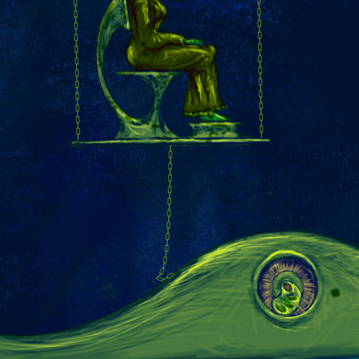
Anyways ... I have tried to design an alternative look for Algodoo. I imagine that circles and boxes could have a fixed look - I have given all circle object the same circular brushed chrome texture. I have also given the objects some primitive 2½D effects.
It still need something to show the proportions. There is nothing in the scene indicating how large the machinery is. I imagine that the textures could do that.
- Kasper Hviid
- Posts: 11
- Joined: Sat Feb 04, 2012 8:52 pm
Re: Visual ideas
![]() by jonatan » Mon Feb 13, 2012 3:16 pm
by jonatan » Mon Feb 13, 2012 3:16 pm
Hi!
Good ideas. We have been discussing this many times but have never really found the time to implement new look and feel in the scenes and palettes more than colors. And I would love to create cool visual effects and styles in Algodoo making it even more attractive. But in the same time we should be careful to avoid making it to cluttered by using to much effects and styles...
But, keep posting you thoughts and ideas here and we will defently keep uppdated!
/Jonatan
- jonatan
- Posts: 15
- Joined: Mon Aug 02, 2010 10:59 am
Re: Visual ideas
![]() by monstertje3 » Wed Feb 15, 2012 4:31 pm
by monstertje3 » Wed Feb 15, 2012 4:31 pm
something that is defenitely needed is a background texture
for objects, maybe a standard noise on all objects
for objects, maybe a standard noise on all objects
Basically, there are only 10 types of people in the world. Those who know binary, and those who don't.
Light travels faster than sound. That's why some people appear bright until they open their mouths.
Light travels faster than sound. That's why some people appear bright until they open their mouths.
-

monstertje3 - Posts: 343
- Joined: Sat Sep 05, 2009 4:29 pm
- Location: N-H, NL
Re: Visual ideas
![]() by Kasper Hviid » Wed Feb 15, 2012 5:19 pm
by Kasper Hviid » Wed Feb 15, 2012 5:19 pm
monstertje3, I totally agree with you. The "digital" look has been over-used. Take a look at any flash game site: The computer is always the deciding factor in the visuals. For this reason, I would prefer a style which aims at something analog: Photos, paper, lineart, clay ... just something else.
On the other hand, I like that everything is so simple that a circle can represent anything, and the style wins point for giving the game an innocent "just a fun little game" appeal, that is inviting. Also, the flat look is not just used in clipart and cheap paint apps. Lots of asian graphic artist use it, and it has even spawned an art movement called superflat.
I have a deadline for some poster, so I gotta go, but I will be back. The visuals could take many forms.
- Kasper Hviid
- Posts: 11
- Joined: Sat Feb 04, 2012 8:52 pm
Re: Visual ideas
![]() by Kasper Hviid » Tue Apr 17, 2012 12:32 am
by Kasper Hviid » Tue Apr 17, 2012 12:32 am
I totally forgot about this - but here's some more thoughts:
TWO VIEWING MODES
Architectural drawings are highly stylized. They are destilated information, you won't find a single line without purpose.

However, to be able to truly understand the construction before it is build, the architects needs to create more rich drawings.
Of course, today we are talking about CAD and 3D renderings, but the same still applies. Note that the eyecandy in this case has a practical purpose: To give a higher understanding of the design, before it is converted to reality.
Inspired by this, Algodoo should have two modes: 'Design' and 'Play'.
This makes it possible to first design a 50 kg yoyo without being bothered with any non-relevant information, while the play mode will let you actually experiencing such a construction in action.
The Design mode could then be purely aimed at design, for instance could color be used to show the objects connections or stacking order.
PROPORTIONS
Check this blogpost:
http://sevencamels.blogspot.com/2011/04/scale.html
I can see four ways that Algodoo could gives the user a sense of proportions:
A) There could be a changing pictogram next to the size icon in the lower right, to give a graphical indicator of the proportions. The pictogram could also be shown when creating a new shape.
B) The textures can look like a piece of material with that exact size. A small wooden object will show you the wooden veins, while a larger object will consist of several wooden planks.
C) The collection of phunlet shapes will give the scene some natural size indicaters.
D) The plane tool can have some markers to indicate the size: Blade of grass when up-close, bushes when a bit further away, and large tress and mountains and skies when far way. The user can also apply this to other forms. There is also one with cityscapes, or the user can make his own. Since the clouds are now part of the plane objects, the background should instead feature a star field.
Se some examples here:
http://img43.imageshack.us/img43/4160/algodoproportions.jpg
TEXTURE AND PROPORTIONS
Millenium Falcon! Look how big it is:
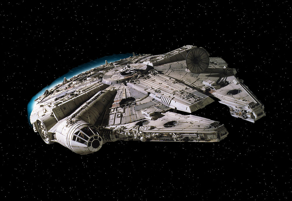
But, how exactly is it that we get that sense of something huge here? The trick is that it is filled with all those details that such a big construction would be likely to have.
Like this nice metal structure:
https://en.wikipedia.org/wiki/File:MetalWallStud.JPG
Likewise, a really big mass in Algodoo should look just as detailed as if it was constructed in real life. You won't find any block of tree at 10x10 meters, so it will have to be build by several blocks of wood.
I consider if Algodoo should use milimeters, centimeters and kilometers. What is your stand here? In some way, I like that the program keep to raw meters.
STYLE
If you want to look at alternative way to represent vector graphic, I would recommend checking out Sketchup:
1) Download Sketchup, run the program
2) In the menu, select:
Camera > Standard Views > Top
Camera > Parallel Projection
3) Draw some shapes with rectangle, circle and line tool.
4) In the menu, select:
Window > Styles
... now take a look at the various styles that can be applied.
One feature I would like would be automatic line thickness. So a collection of shapes would have a thick silhuet outline, while the lines inside would be more discrete. Also, cell shadows could be cast on the objects below, their distance depending on their distance in the virtual world (the shadow would be based on the two objects collision layer, their z position, if they are colliding, and if they are axled/fixated)
TWO VIEWING MODES
Architectural drawings are highly stylized. They are destilated information, you won't find a single line without purpose.
However, to be able to truly understand the construction before it is build, the architects needs to create more rich drawings.
Of course, today we are talking about CAD and 3D renderings, but the same still applies. Note that the eyecandy in this case has a practical purpose: To give a higher understanding of the design, before it is converted to reality.
Inspired by this, Algodoo should have two modes: 'Design' and 'Play'.
This makes it possible to first design a 50 kg yoyo without being bothered with any non-relevant information, while the play mode will let you actually experiencing such a construction in action.
The Design mode could then be purely aimed at design, for instance could color be used to show the objects connections or stacking order.
PROPORTIONS
Check this blogpost:
http://sevencamels.blogspot.com/2011/04/scale.html
I can see four ways that Algodoo could gives the user a sense of proportions:
A) There could be a changing pictogram next to the size icon in the lower right, to give a graphical indicator of the proportions. The pictogram could also be shown when creating a new shape.
B) The textures can look like a piece of material with that exact size. A small wooden object will show you the wooden veins, while a larger object will consist of several wooden planks.
C) The collection of phunlet shapes will give the scene some natural size indicaters.
D) The plane tool can have some markers to indicate the size: Blade of grass when up-close, bushes when a bit further away, and large tress and mountains and skies when far way. The user can also apply this to other forms. There is also one with cityscapes, or the user can make his own. Since the clouds are now part of the plane objects, the background should instead feature a star field.
Se some examples here:
http://img43.imageshack.us/img43/4160/algodoproportions.jpg
TEXTURE AND PROPORTIONS
Millenium Falcon! Look how big it is:
But, how exactly is it that we get that sense of something huge here? The trick is that it is filled with all those details that such a big construction would be likely to have.
Like this nice metal structure:
https://en.wikipedia.org/wiki/File:MetalWallStud.JPG
Likewise, a really big mass in Algodoo should look just as detailed as if it was constructed in real life. You won't find any block of tree at 10x10 meters, so it will have to be build by several blocks of wood.
I consider if Algodoo should use milimeters, centimeters and kilometers. What is your stand here? In some way, I like that the program keep to raw meters.
STYLE
If you want to look at alternative way to represent vector graphic, I would recommend checking out Sketchup:
1) Download Sketchup, run the program
2) In the menu, select:
Camera > Standard Views > Top
Camera > Parallel Projection
3) Draw some shapes with rectangle, circle and line tool.
4) In the menu, select:
Window > Styles
... now take a look at the various styles that can be applied.
One feature I would like would be automatic line thickness. So a collection of shapes would have a thick silhuet outline, while the lines inside would be more discrete. Also, cell shadows could be cast on the objects below, their distance depending on their distance in the virtual world (the shadow would be based on the two objects collision layer, their z position, if they are colliding, and if they are axled/fixated)
- Kasper Hviid
- Posts: 11
- Joined: Sat Feb 04, 2012 8:52 pm
Re: Visual ideas
![]() by MrLucasManSwe » Thu Apr 19, 2012 10:42 am
by MrLucasManSwe » Thu Apr 19, 2012 10:42 am
I think Algodoo should have sound. 
(You can drag an sound file into it, like an texture.)
(You can drag an sound file into it, like an texture.)


-
MrLucasManSwe - Posts: 76
- Joined: Sat Nov 26, 2011 5:59 pm
- Location: Västra götaland, Sweden
Re: Visual ideas
![]() by Under Ground » Wed Apr 25, 2012 10:42 pm
by Under Ground » Wed Apr 25, 2012 10:42 pm
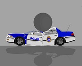
Hey, textureless objects can look pretty too!
-Advertisement-
-Advertisement-

-

Under Ground - Posts: 819
- Joined: Mon Aug 31, 2009 6:52 pm
- Location: In A Cave, Somewhere On Mars.
Re: Visual ideas
![]() by hiltropper » Sat Jun 02, 2012 2:10 pm
by hiltropper » Sat Jun 02, 2012 2:10 pm
@ MrLucasManSwe
i think so many people guessed this they will have recognized it already
sound would be very very nice but the style improvement sounds nice too
i think so many people guessed this they will have recognized it already
sound would be very very nice but the style improvement sounds nice too
yup yup
yuuuuuuup
yupyupyupyupyupyupyupyupyyyuuuup
hm... signatures...
yuuuuuuup
yupyupyupyupyupyupyupyupyyyuuuup
hm... signatures...
- hiltropper
- Posts: 85
- Joined: Mon Dec 20, 2010 12:02 pm
- Location: Germany
10 posts • Page 1 of 1
Who is online
Users browsing this forum: No registered users and 5 guests


